Erika Lindsey is a former PPL senior research lead.
In my second month as a fellow at the Public Policy Lab (PPL), back in 2019, my co-fellow Talia Radywyl and I were paired on a project called Navigating Home to improve move-out rates from New York City homeless shelters. I had joined PPL after an almost decade-long career as an urban planner, and while I had research experience, this was my first end-to-end service design project.
As a planner, I had context on the operations of complex government systems. I understood how agencies worked together and how programs were funded and run. My work involved making a lot of maps—such as zoning maps and flood maps—but my favorite part was translating complicated technical concepts into accessible visuals that drove agencies, elected officials, and New Yorkers to make more informed decisions. However, the ways we were engaging the public for input, such as community board meetings or public hearings, started to feel like box-checking exercises. When I learned that there were other approaches where people’s lived experiences directly informed the design of new programs and services, I made the leap to explore them—which is what eventually landed me at PPL.
In the Navigating Home project, the NYC Department of Social Services (DSS) and the NYC Department of Homeless Services (DHS) wanted to understand how they could better assist New Yorkers experiencing homelessness in transitioning to permanent housing. For three years, our team worked with a dozen shelters across the city to learn why some shelters were more successful in moving people into permanent housing than others. Going in, our team understood how DSS and DHS worked with each other, but there was a lot for us to learn about the nuanced interactions between agency staff, shelter staff, and shelter residents. Talia’s extensive experience with human-centered research and digital service design and my deep understanding of complex government systems complemented each other well, but for both of us, it was our first time delving into a system as complex as New York City’s homeless shelters.
This project taught me about a different kind of mapping than what I was used to. Instead of conducting a spatial analysis of risk, we were mapping processes and experiences. And instead of creating a map of a service and handing it off, our maps were co-created by the people who had firsthand experience of delivering and using that service.
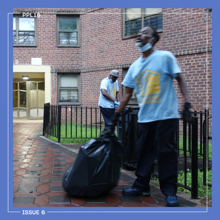
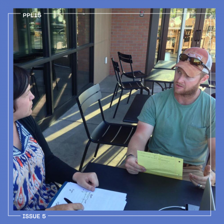
Our team began by talking to people. We schlepped around the city, conducting research in shelters in The Bronx, Brooklyn, Manhattan, and Queens. Some shelters had decorations and bulletin boards with upcoming events, setting up a more welcoming atmosphere; others were more sparse, with no communal space or social programming. For our conversations, we met people wherever they were—in resident community rooms, staff break rooms, or in the foyer of the shelter lobby. In just five months, we spent over 250 hours speaking with more than 200 shelter staff and residents. To conduct all of this research in a limited amount of time, we seized every opportunity we could to sit down with people. We even squeezed ourselves onto the agenda for a DHS conference for staff, organizing a codesign workshop for housing specialists to understand their needs and priorities.
We found that residents’ experiences with the shelter system varied. Some residents worked collaboratively with staff to set goals and felt very supported, while others met inconsistently with staff and felt like they were in a holding pattern in their shelter experience. Most residents shared that they yearned for a place of their own. “I’m just trying to do the best that I can,” one resident explained to us. “And I don’t want the shelter to think that I’m not doing anything to get out of here. I am. It’s not a bad place. It’s just not mine.”
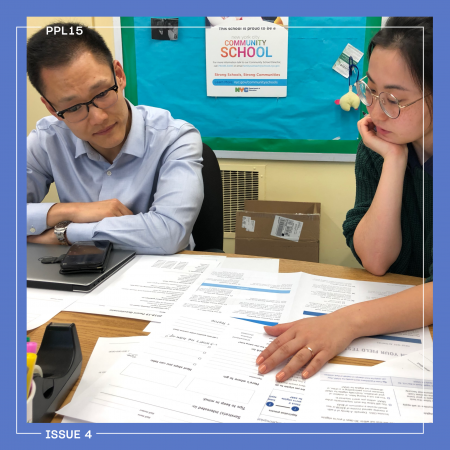
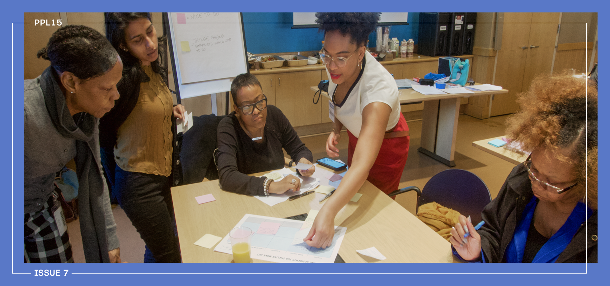
As we began to piece together the wide array of experiences across shelter staff and residents, we realized we needed to build a shared understanding of what the system looked like. We took out printer paper and Post-its, and asked frontline staff, program leaders, and shelter residents to describe the shelter experience from their vantage point. Participants mapped out each step of the journey from shelter to permanent housing as they understood it, which helped us identify any gaps and overlaps across the different experiences. There were moments when people were not sure what the next step was, or where the order of steps was inconsistent. “Everyone gives you different information,” one resident noted. We also learned that the existing resource to document residents’ transition to permanent housing, the Independent Living Plan (ILP), wasn’t as useful as it could be, as one frontline provider pointed out: “The ILP is very client-focused but doesn’t include what caseworkers should do to help clients progress.”
We started our research with a rough journey map, sketching out the high-level steps we had gathered from early interviews. By the end of the month, we had a detailed service blueprint visualizing each step, associated touchpoints, and key materials. Mapping this journey wasn’t just useful for our team’s understanding of the system; it served shelter staff and residents as well. Many staff members had different approaches to the move-out process, which meant that residents’ experiences were dependent on the staff member they were working with. Staff needed a standardized visual overview of the rehousing process so that everyone could follow a consistent set of steps.
The blueprint also helped residents get a sense of their overall trajectory toward permanent housing. One resident shared: “[The map] was so helpful because usually you really don’t know what is next. You know what people tell you, but sometimes you don’t have a clear picture of that.”
Coming out of research, we were proud of the service blueprint we made. It was the first map of its kind documenting the rehousing process in New York City. But every time we wanted to display it, we had to unfurl a massive printout that was at least ten feet long and tape it up across the office walls. People had to get really close to read all of the detailed information. The blueprint made sense in the first phase, when we were building an understanding of how the system worked, but it was too complicated to be used by shelter staff in their day-to-day work. They were managing a lot, juggling large caseloads with individualized client needs. What they needed was an easy framework they could remember.
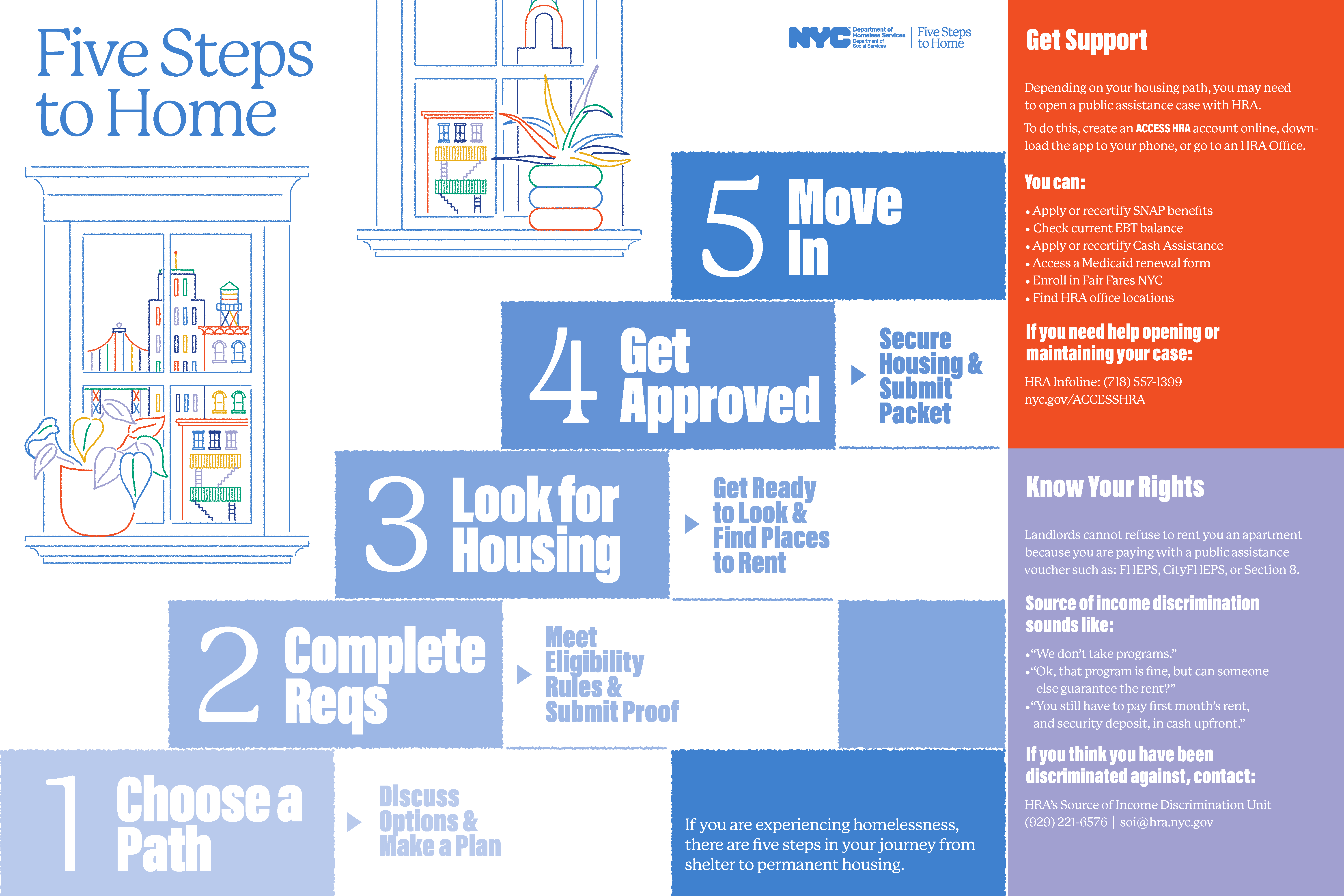
With that in mind, we decided to take our comprehensive service blueprint and distill it into a more accessible format: a simple poster. The poster, Five Steps to Home, provided a visual explainer of the five main phases of the rehousing process: Choose a Path, Complete Requirements, Look for Housing, Get Approved, and Move In. It was simple, clear, and easy to recall. For each step, we created supporting tools—worksheets, a decision tree, and an eligibility table—drawn from best practices at high-performing shelters across the city. Much of the detailed information from the service blueprint was migrated into worksheets, one for each of the five steps. This suite of materials created more clarity and transparency in the process, helping residents and staff visualize their path forward and make more informed decisions.
Beyond making our materials visually compelling, we had to ensure they were policy-compliant. There was an overwhelming amount of information available about different rehousing requirements. We empathized with shelter staff who had to sort through these requirements and match them to their clients’ histories and support needs. After a deep dive into policy research, we translated the complicated eligibility rules into visuals that were comprehensible to both staff and residents. It captured the knowledge that was already in staff members’ brains and made it available to residents, so that they were informed about their options.
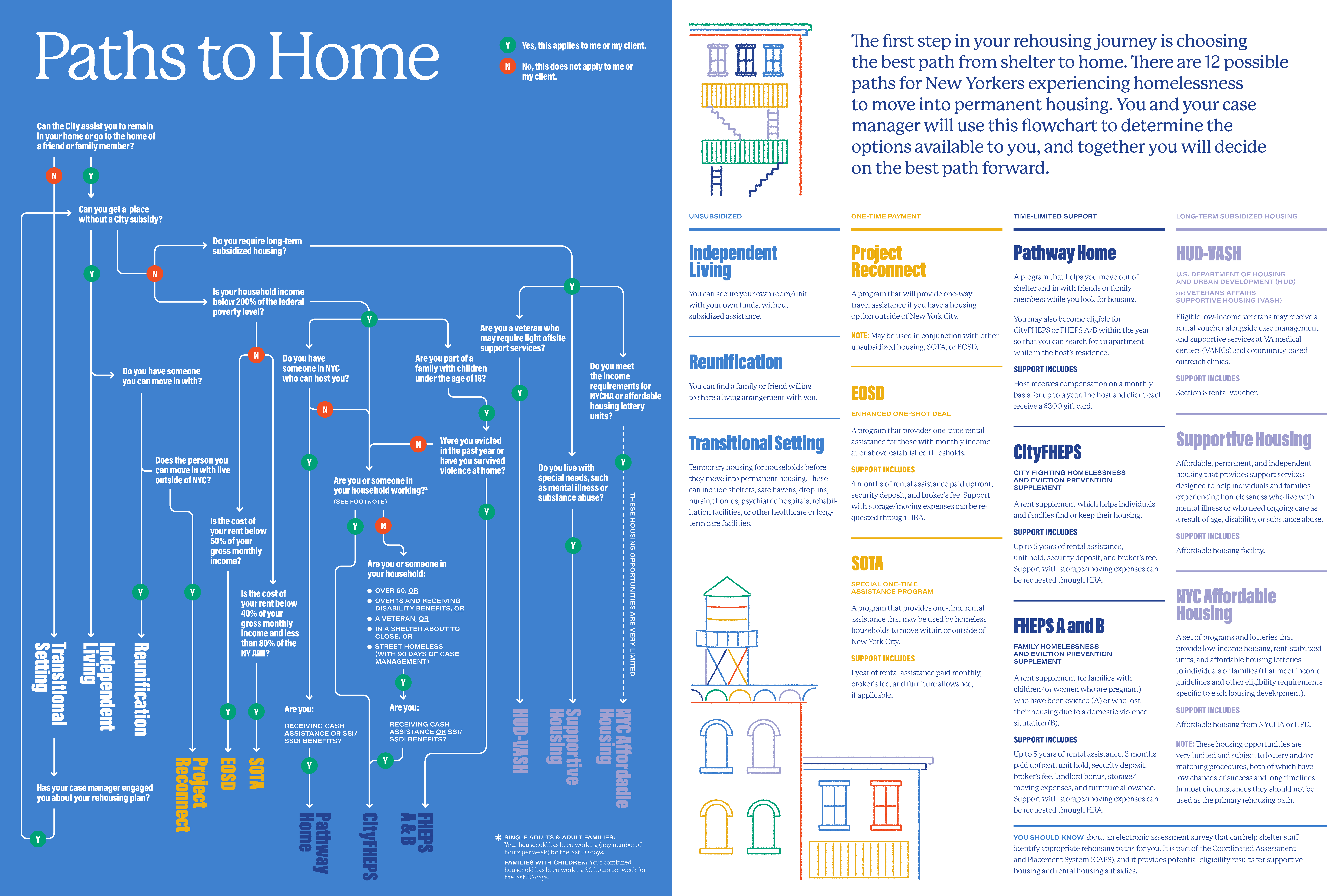
Beginning in 2022, DHS made the Five Steps to Home suite of tools available to shelters citywide. The Five Steps to Home framework worked so well that DHS even revamped the backend of its case management database to align with the framework. Frontline staff could update their client’s status by selecting one of the steps, from “Choose a Path” to “Move In.” The accompanying tools gave shelter staff a consistent framework to guide their work and gave residents a sense of what lay ahead.
These final outputs were deceptively simple, but the path there involved wrangling with complexity. Mapping helped us make sense of that complexity, visualizing every detail of the system on our service blueprint, before ultimately boiling it down to its most important components. In the end, we didn’t just create a set of tools but also supported the shift to an entirely new mental model for shelter staff and residents—changing how people understood the shelter system, their place in it, and what came next.
Mapping is often treated as a documentation exercise. But this project taught us that mapping can do more than capture how a system works; it can reveal the gap between how it is supposed to work and how it is actually experienced. When everyone has a clearer mental model, residents will receive more consistent support regardless of what shelter they are in and can take more proactive roles in their rehousing process. In complex systems, where a lack of transparency, overwhelming information, and inconsistency can block progress, that kind of clarity makes real change possible.
As the Public Policy Lab marks its 15th year, we’re publishing a series of essays reflecting on the projects that shaped us and what they’ve taught us about public-interest innovation. Each post is paired with a related conversation, bringing practitioners together to explore the theme and its implications for the future of public systems.
Erika Lindsey, “The Case for Mapping: Why Visualizing Complex Systems Matters,” New York, NY: Public Policy Lab, July 6, 2026, https://www.publicpolicylab.org/resources/the-case-for-mapping